Have you heard about the changes that Google has slated for search algorithms starting April 21st?
As a growing number of web-enabled devices are handheld, Google has made an effort to place higher value on websites which bring you the information you seek in a format that will be easier to access that same information on a smaller screen.
Basically the search engine giant is classifying websites as “Mobile Friendly” or “Not Mobile Friendly”, and it will affect search results accordingly.
While this does seem very black and white, the good news is that Google has given plenty of forewarning on the subject and they have made it very easy for you to determine whether you fall in the one category, or the other.
With one quick link, their analysis will provide instantaneous feedback on simple fixes that you can make which can help your ranking.
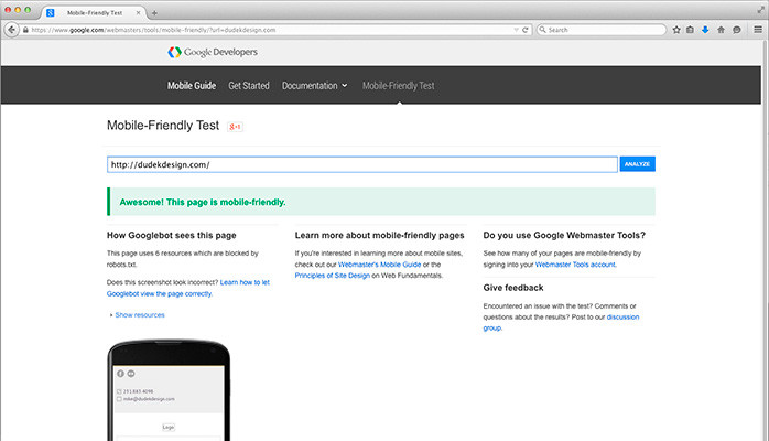
Take Google’s Mobile-Friendly Test. (it’s free, and quick!)

And if you are using WordPress (a fairly universal Content Management System which is open source, and therefore freely available to all users), there are a multitude of professionally designed themes which immediately fall into the “Mobile Friendly” category.
What’s more, these templates are optimized so that your website will look its best whether viewed on a laptop, monitor or handheld device (i.e., smart phone or tablet).
Now if you find your site is not “Mobile Friendly”, fear not.
There are still three weeks until the changes come into effect, and even after April 21st, page rankings will still be updated in real time.
And you’re not alone. I tested several major sites including Wikipedia.com and Weather.com, and Google’s analytics finds issues with both. (That said, I would be surprised because of the immense site traffic that either one will see any noticeable drop in search rankings!)
What specifically are some of the common issues?
As was the case with Weather.com:
Page appears not mobile-friendly
• Text too small to read
• Mobile viewport not set
• Links too close together
• Content wider than screen

(In other words, most users on a phone or tablet will have to scroll left to right, in addition to scrolling from top to bottom.)
These issues are quite easily fixed with the vast majority of mobile-responsive WordPress templates. Some content may have to be adjusted to display optimally, but for your average website these adjustments may be a worthwhile undertaking for a higher Google ranking.
Learn more here: https://developers.google.com/webmasters/mobile-sites/

If you’d be interested in an initial consultation or website review, I’d be happy to speak with you prior to April 21st or anytime thereafter. Feel free to contact me today!